“Design is not just what it looks like and feels like. Design is how it works.” – Steve Jobs
Did you know that over 60% of internet traffic comes from mobile devices? Yet, surprisingly, many businesses still focus primarily on desktop layouts. In my experience, ignoring mobile users is like closing the door to the majority of potential customers. A well-executed responsive web design not only ensures a smooth experience across devices but also directly impacts engagement, SEO, and conversions.
Let’s dive into the benefits of responsive web design, why it matters, and how it can boost mobile traffic effectively.
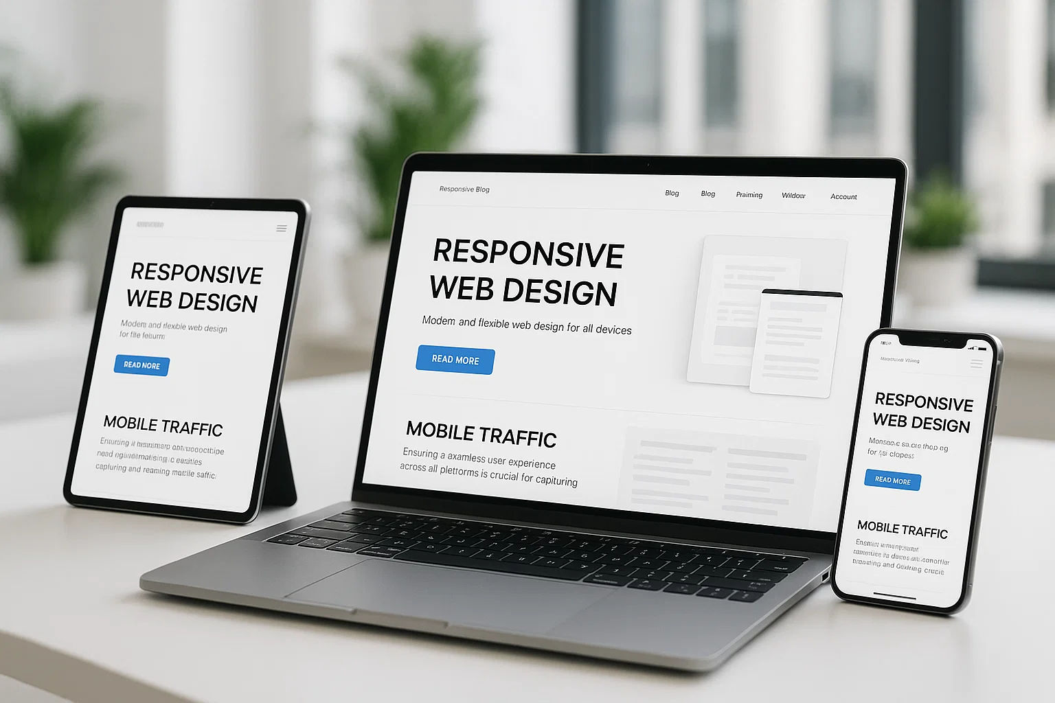
What is Responsive Web Design?
Responsive web design (RWD) is an approach where your website adapts seamlessly to any screen size, whether it’s a smartphone, tablet, or desktop. It’s not merely resizing elements; it’s about restructuring content, navigation, and visuals so that the website feels natural on every device.
I’ve seen businesses lose mobile users simply because their sites required zooming, horizontal scrolling, or confusing navigation. A responsive design eliminates these barriers, providing a consistent and enjoyable experience for everyone.
Key insight: Responsive design is no longer optional. With the growth of mobile usage, it’s a necessity for every business.
Why Responsive Design Matters
Mobile users have different browsing behaviors than desktop users. They tend to look for quick answers, easily digestible content, and smooth navigation. Google reports that 61% of users are unlikely to return to a mobile site they had trouble accessing, and 40% visit a competitor’s site instead.
In my experience, when businesses switch to responsive design, bounce rates drop significantly. Visitors stay longer, engage more with content, and are more likely to convert. This makes it clear why responsive design matters for any modern website.

Benefits of Responsive Web Design
a. Improved User Experience
A responsive site ensures content fits perfectly on every device. Buttons, menus, and forms are easily accessible without zooming or scrolling unnecessarily.
Example: A retail client saw a 50% increase in mobile session duration after implementing responsive design. Visitors could browse products smoothly and make purchases without frustration.
Creating a smooth and enjoyable experience for visitors is key, which is why understanding the importance of website design can further enhance your site’s usability and engagement.
b. Faster Page Loading
Responsive websites optimize images and layouts for different devices, which often reduces loading times.
Why it matters: Faster pages = happier users. Mobile users expect quick access, and slow-loading sites lead to high bounce rates.
c. Better SEO Performance
Google favors mobile-friendly sites, meaning responsive websites rank higher in mobile search results. This directly affects organic traffic and visibility.
Statistic: Mobile-friendly sites have a significantly lower bounce rate, which positively impacts search rankings.
d. Increased Conversions
Easy navigation and accessible content directly influence conversions. Users who find what they need quickly are more likely to take action.
Example: A service-based client increased mobile form submissions by 35% after making their website fully responsive.
Mobile Web Design Benefits Beyond Traffic
Responsive design offers advantages beyond just mobile visits:
- Brand Credibility: A professional, mobile-friendly site signals reliability.
- Cost Efficiency: You don’t need separate websites or apps for different devices.
- Future-Proofing: Responsive sites adapt to new devices and screen sizes automatically.
- I often tell clients: “Responsive design isn’t just about mobile-it’s about accessibility, user satisfaction, and long-term sustainability.”

Common Mistakes to Avoid
Even with responsive design, mistakes can hinder performance:
- Tiny fonts and buttons: Make content hard to read or interact with.
- Heavy graphics: Slow down mobile pages.
- Cluttered layouts: Overwhelms mobile users.
Correcting these ensures you get the full benefits of responsive web design.
Real-Life Examples of Responsive Success
- E-commerce: A clothing retailer revamped their site responsively and increased mobile sales by 45%.
- Travel portals: Mobile-friendly designs led to longer session durations and more bookings.
- Local services: Businesses saw more calls and inquiries from mobile users after switching to responsive layouts.
These examples show that mobile web design benefits go beyond traffic-they improve engagement, trust, and conversions.
Future Trends in Responsive Web Design
Responsive design continues to evolve:
- Progressive Web Apps (PWAs): Combine website and app experiences seamlessly.
- Voice Search Optimization: Mobile-friendly sites perform better with voice searches.
- Dynamic Content: Personalized layouts and recommendations for mobile users increase engagement.
Staying updated ensures your website remains competitive and effective.
Tips to Maximize Mobile Traffic with Responsive Design
- Prioritize Mobile UX: Place key content and CTAs within easy reach.
- Optimize Images: Compress and resize for faster loading.
- Test Across Devices: Regularly check layout, readability, and navigation on smartphones and tablets.
- Monitor Analytics: Track mobile engagement metrics and adjust design accordingly.
Implementing these strategies ensures you maximize the benefits of responsive web design.
Final Thoughts
Responsive web design isn’t just a technical upgrade-it’s a strategic business decision. From enhancing user experience and SEO to increasing conversions and mobile traffic, the advantages are undeniable.
Mobile users are growing rapidly. A website that adapts to any device ensures your business doesn’t lose potential customers. In my experience, businesses that invest in responsive design see higher engagement, trust, and revenue.
Simply put, “Why responsive design matters” because it connects your business to the devices people actually use every day.